Card title
This text stays normal dark-on-white, regardless of the tile color.
Four building blocks for typical marketing/landing-page pieces: .ncss-split (text next to an image), .ncss-tile (full-width color blocks, known from UIkit), .ncss-accordion-split (transforming accordion, known from apple.com) and .ncss-marginnote (margin notes, known from Tufte CSS). Split and Tile are combinable - a Tile as the background surface, a Split layout inside it.
.ncss-split-container establishes the container-query context (an element can't query its own width by spec, see Cards, section 6 for the same constraint), .ncss-split is the actual two-column layout. From 36rem CONTAINER width the media and content columns sit side by side; below that they stack automatically.
<div class="ncss-split-container">
  <div class="ncss-split">
    <div class="ncss-split-media"><img src="photo.jpg" alt="..."></div>
    <div class="ncss-split-content">
      <h3>Title</h3>
      <p>Text ...</p>
    </div>
  </div>
</div>Shrink the window/panel to see it stack below 36rem.
No modifier needed - plain document order, exactly like Cards (.ncss-card-media top/bottom). .ncss-split-media as the FIRST child = left (and on top when stacked), as the LAST child = right (and at the bottom when stacked). No row-reverse trick that would decouple reading/focus order from the visual layout.
<!-- Image right: .ncss-split-media simply as the LAST child -->
<div class="ncss-split">
  <div class="ncss-split-content">...</div>
  <div class="ncss-split-media">...</div>
</div>Same class, just the child order in the markup is swapped.
--ncss-split-align (default center) controls how the two columns align to each other once they sit side by side - no effect while stacked. Convenience classes for the most common values:
| Class | Effect |
|---|---|
.ncss-split--align-start | Both columns aligned to the top |
.ncss-split--align-end | Both columns aligned to the bottom |
.ncss-split--align-stretch | Both columns stretched to equal height |
For an asymmetric width ratio (instead of 50/50), set --ncss-split-media-width directly on .ncss-split-media - the content column automatically fills the rest, always adding up to 100%:
<div class="ncss-split ncss-split--align-start">
  <div class="ncss-split-media" style="--ncss-split-media-width: 40%;">...</div>
  <div class="ncss-split-content">...</div>
</div>Media narrower than the content column, both flush to the top instead of centered.
Known from UIkit (uk-tile-default/-muted/-primary/-secondary) - full-width blocks for dividing a long page into clearly distinct sections. .ncss-tile alone (no modifier) is the normal page surface, no visible difference from its surroundings besides its own padding.
| Class | UIkit equivalent | Effect |
|---|---|---|
.ncss-tile | uk-tile-default | Normal page surface |
.ncss-tile--muted | uk-tile-muted | --ncss-color-bg-subtle as background |
.ncss-tile--brand | uk-tile-primary | Brand color, text automatically flips light |
.ncss-tile--brand-2 | uk-tile-secondary | Secondary color, text automatically flips light |
<section class="ncss-tile ncss-tile--brand">
  <h2>Title</h2>
  <p>Text ...</p>
</section>--brand)Light text automatically, no extra class needed.
--brand-2)Same automatic text flip, a different brand color.
The automatic light text of --brand/--brand-2 is a plain descendant-selector inheritance - without a countermeasure it would also leak into a nested white .ncss-card and become unreadable there (the same gotcha first found on product.html, solved generically here from the start). .ncss-tile therefore resets .ncss-card and <pre> INSIDE it back to normal dark text automatically:
This text is light.
This text stays normal dark-on-white, regardless of the tile color.
Both building blocks are deliberately independent - a Tile as the background surface, a normal Split layout inside it. For full screen width (instead of just the current container) additionally combine .ncss-full-bleed on the Tile - Tile itself doesn't break out of a surrounding .ncss-container on its own, that stays a deliberately separate decision.
<section class="ncss-tile ncss-tile--muted ncss-full-bleed">
  <div class="ncss-container">
    <div class="ncss-split-container">
      <div class="ncss-split">
        <div class="ncss-split-media">...</div>
        <div class="ncss-split-content">...</div>
      </div>
    </div>
  </div>
</section>Two independent building blocks, freely combinable.
Known from apple.com - a text accordion whose associated image on the right automatically switches with whichever point is currently open. Completely native, NO JavaScript needed: exclusive open/close via <details name="..."> (Baseline since September 2025), the matching image is selected via :has() - the same technique already used by pre:has(> code[class*="language-"]) for the code blocks on this page. Opening/closing itself is already smoothly animated (::details-content). For a soft transition on the IMAGE SWAP itself (instead of a hard cut), optionally include js/view-transitions.js - see below.
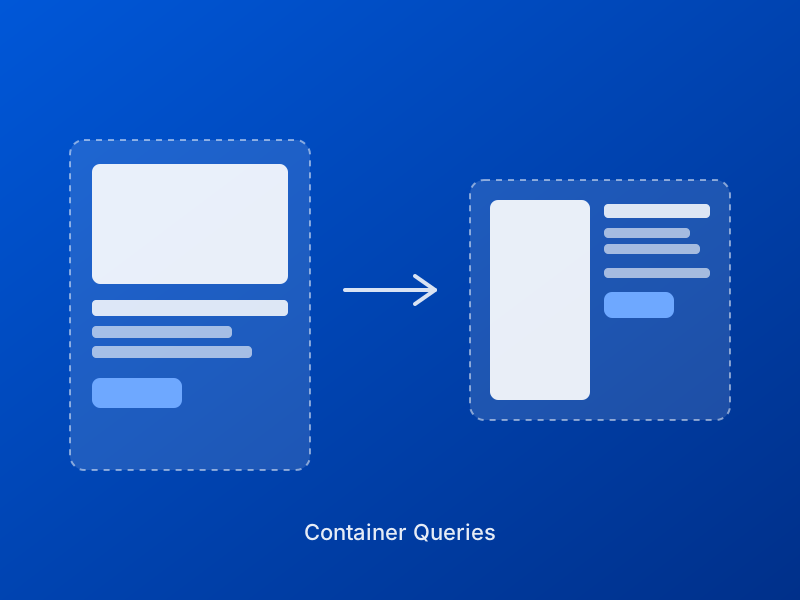
Components react to their own available space, not the viewport.
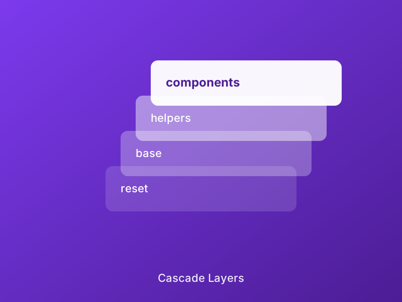
Order instead of specificity fights - no !important needed.
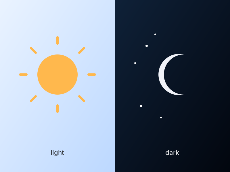
One value per token covers both light and dark - no second stylesheet.
<div class="ncss-accordion-split-container">
  <div class="ncss-accordion-split">
    <div class="ncss-accordion-split-list">
      <details name="my-accordion" class="ncss-accordion-split-item" open>
        <summary>Point one</summary>
        <div class="ncss-accordion-split-body">
          <p>Text ...</p>
          <!-- for stacking on mobile, same image as below -->
          <div class="ncss-accordion-split-media-mobile"><img src="image-1.jpg" alt="..."></div>
        </div>
      </details>
      <!-- more points, always the same name="..." -->
    </div>
    <div class="ncss-accordion-split-media">
      <img src="image-1.jpg" alt="...">
      <!-- one image per point, same order -->
    </div>
  </div>
</div>
name="..." must be unique per accordion instance on the page (like a radio-button group), otherwise multiple accordions unintentionally group together. Each image deliberately appears TWICE in the markup (desktop column + mobile inline copy) - without JS a DOM node can't be moved between two distant containers. The same image URL is still only loaded once (normal HTTP caching), and only one of the two copies is ever in the layout at a given breakpoint. Supports up to 6 points (more would be unusual for this pattern anyway).
js/view-transitions.js uses same-document View Transitions (Chrome/Edge 111+, Safari 18+, Firefox 133+) to animate the image swap smoothly instead of a hard cut - a cross-fade is the default (no markup needed), data-transition="slide"/"3d" on .ncss-accordion-split-container switch to a slide or a 3D flip instead. Without the script, or in browsers without View Transitions support, the native, instant swap stays intact - no loss of function. The example above already uses the live cross-fade.
<script src="js/view-transitions.js" defer></script>

<div class="ncss-accordion-split-container" data-transition="slide">
  <!-- ... -->
</div>
Technical background (including why it intercepts the click on <summary> instead of a beforetoggle event, and how view-transition-class distinguishes multiple instances on the same page) in the source comment.
An image OR text breaks out of the text column, but doesn't land at the screen edge (that's already covered by .ncss-bleed-start/-end, see Layout) - instead it lands in the margin NEXT to the running text - a sidenote pattern, known from Tufte CSS, rebuilt independently here: pure CSS Grid instead of fixed pixel margins. .ncss-marginnote-layout is a 3-column grid (margin column / text column / margin column); the text column caps at --ncss-container-max-narrow, the two margin columns shrink to 0 on narrow containers on their own - normal children (paragraphs) always stay in the middle column, only .ncss-marginnote-start/-end jump into their margin column once the grid is wide enough (60rem), below that they stay a normal block in the text flow.
Why a margin note automatically lands next to the right paragraph without knowing its own position: CSS Grid's auto-placement lays out elements in document order and keeps reusing the same row as long as its own column is still free there. That gives a simple but important markup rule (confirmed by real testing - the two margin columns do NOT behave symmetrically):
| Class | Margin column | Goes in the markup ... |
|---|---|---|
.ncss-marginnote-end | after (usually right) | DIRECTLY AFTER the paragraph it belongs to |
.ncss-marginnote-start | before (usually left) | DIRECTLY BEFORE the paragraph it belongs to |
Container queries let components respond to their own available space instead of the viewport - the same idea this margin-note layout itself relies on.
Second paragraph, with a note next to it on the left.
Third paragraph with no margin note at all - the space next to it simply stays empty, no extra rule needed for that.
<div class="ncss-marginnote-container">
  <div class="ncss-marginnote-layout">
    <p>Text this note belongs to ...</p>
    <aside class="ncss-marginnote-end"><img src="photo.jpg" alt="..."></aside>
    <p>Next paragraph ...</p>
    <aside class="ncss-marginnote-start"><p>A plain text margin note.</p></aside>
  </div>
</div>
Works the same way with an image instead of text inside the note (<aside class="ncss-marginnote-end"><img ...></aside>) - the margin column then automatically gets width:100%; height:auto;. Drag the panel narrower than 60rem to see the fallback: below that, every margin note simply stacks in place within the normal text flow, no broken or empty state.